CLIENT
Renew IT
CHALLENGE
Renew IT was established in 2008. Over the last 13 years they have built up a solid
track record in the industry for Asset Buyback and re-marketing. Renew IT have a
global presence with offices in Asia and the USA. The business has operated under the same logo since their establishment and have lacked a cohesive brand aesthetic without brand guidelines or any clear direction in terms of a visual identity, imagery or marketing collateral.
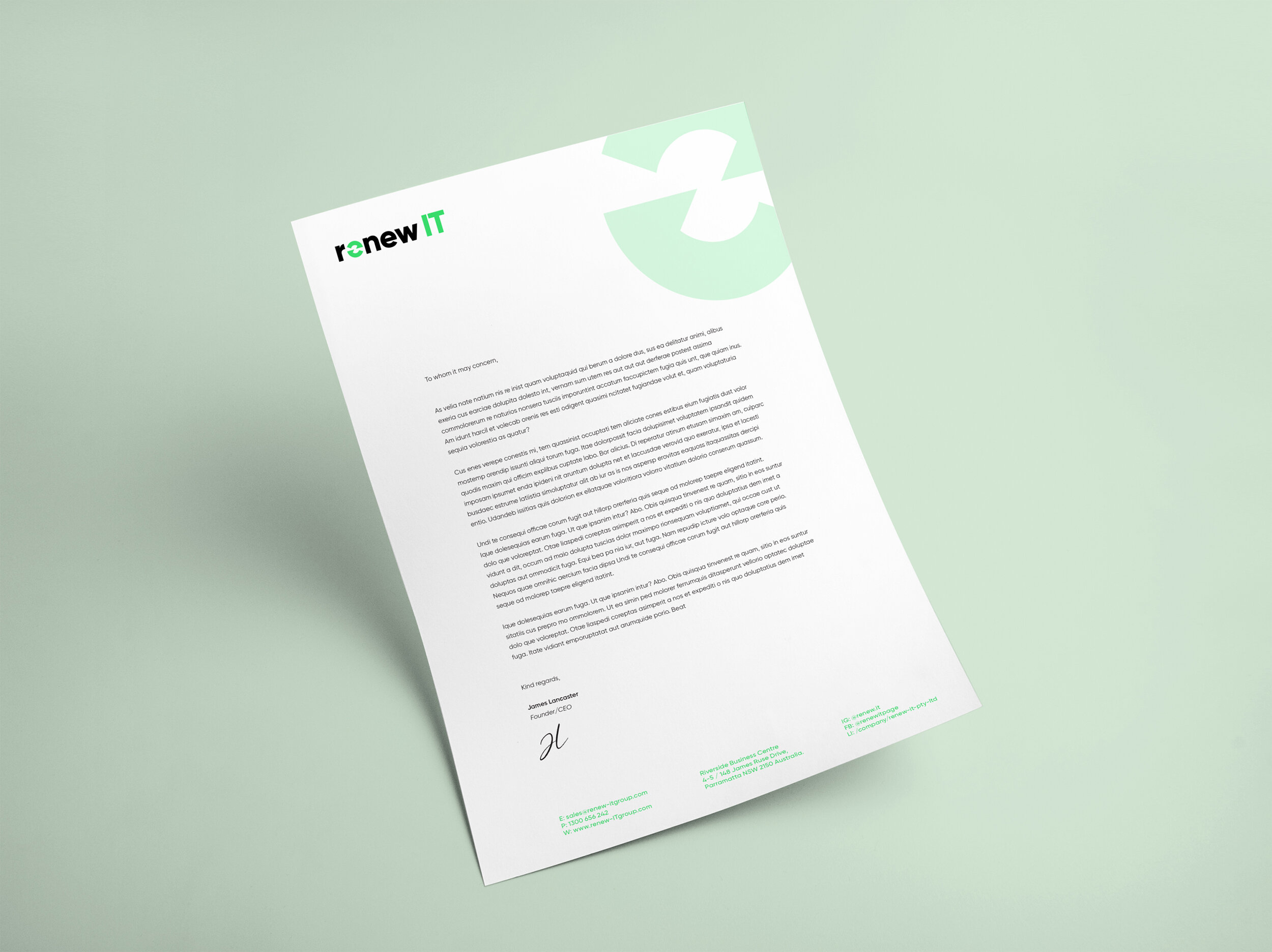
The challenge was to provide a logo in the same style and with a similar concept as the old logo to preserve the brand recognition associated with it whilst evolving the aesthetic and type to bring it into 2021 with a clear establishment of brand look & feel and introducing clear guidelines of how assets should be presented. The end result was a tightly kerned wordmark with a modern typeface and a powerful ‘e’ icon which resembles both an 'e’ and 2 rotating arrows to signify ‘renewal’. This icon becomes the hero piece in the visual identity of Renew IT and the shape is used across various applications.
The overall branding consists of a full colour palette, a set of arrow icons to represent the business’ service offerings, a repeat pattern and other graphic devices to add to the brand’s image and overall aesthetic.
ROLE
Logo design
Collateral design
Brand Guidelines