CLIENT
Tertiary Tech
CHALLENGE
Tertiary Tech is a company which prides itself on expertise in Australia’s higher education sector and uses data analytics to derive unique insights about Australian university degrees. They aim to make the details of university degrees more transparent, so that students have the information they need to make one of the most important decision of their career. To solve this problem, Tertiary Tech have developed an online web application which will revolutionise the way that career advisers and students find and compare university degrees. It provides advanced search tools, degree comparison metrics and graphical representations of degree structures.
The competitors of Tertiary Tech have branding which emulated the old, tired and boring aesthetic of a typical online university. The challenge put forward by the client was to create a logo and branding which was ahead of the curve, attracting those forward thinkers who looked outside the box when it came to deciding the future of their education.
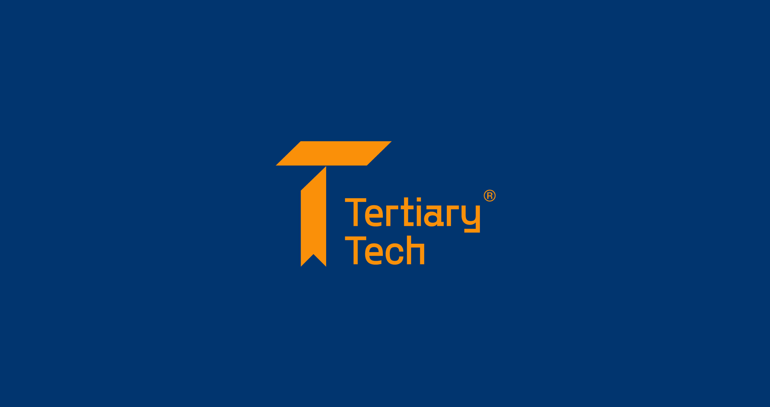
The icon in this concept has a number of connectors which lead back to Tertiary Tech’s scope of work giving the logo meaning. Not only does the mark resemble the letter T, but also creates the basis for the series of geometric shapes which make up the graphic device pattern seen below. It also takes the shape of a textbook and bookmark as if it were laying on a shelf or stack of university material. Finally the T icon also resembles the mortarboard, a hat worn by students at their graduation ceremony. Although the oxford cap itself is often black, the gold colour adopted by this logo concept pays homage to colour of the tassel which hangs from button on top.
ROLE
Logo and identity design
Collateral design